04
Interac Corp.
LIVE Product

Client:
Interac Corp.
Date:
LIVE Product
Role:
Designing the operational layer behind bank payments
Konek Portal is the operational layer behind the payment experience.
Most customers will never see it. That is the point.
A customer-facing payment can look simple on the surface: paid, failed, pending, reversed. Behind that simple state is a system of bank activity, transaction references, reversals, disputes, fees, statuses, sub-statuses, API rules, and operational decisions.
I worked on making that complexity easier for bank and internal users to scan, investigate, and act on.
The challenge was not to make the portal feel flashy. It was to make it feel dependable. Operational tools need to be clear when the stakes are high, when the data is dense, and when the wrong action can create downstream issues.
The hidden side of payments
Payments look clean when they work.
A customer taps a button, authenticates, and sees a confirmation. But the system behind that moment is doing much more: routing, validating, tracking, updating statuses, handling exceptions, and supporting recovery when something goes wrong.
Konek Portal had to expose enough of that system for users to understand what happened without making them feel buried in operational noise.
The goal was to give bank and internal users a clear view into payment activity: what happened, where it happened, what state it was in, and what could be done next.

Status had to drive the interface
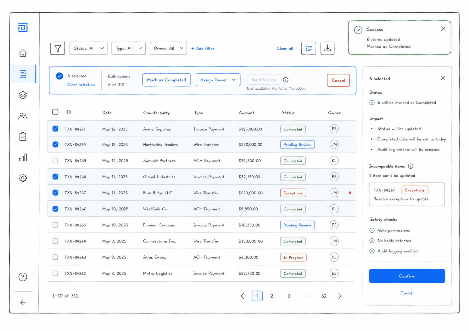
The hardest part of the portal was status logic.
A transaction was not simply open or closed. It could be pending, confirmed, declined, under review, assessment ready, completed, blocked, or sitting in another sub-state that changed what actions were safe.
That meant status could not sit quietly as metadata.
It had to drive the interface.
If a transaction was not ready to be actioned, the UI needed to make that clear. If a reversal could only be managed through API, the portal could not pretend it was available. If multiple rows were selected, the action model had to respect the most restrictive state in the selection.
The interface had to reflect the real workflow underneath it.
The table was the product
In many consumer products, tables are secondary.
In Konek Portal, the table was the product.
Users needed to scan transactions, compare rows, identify statuses, check dates, review amounts, find references, and understand which actions were available. Too much information made the table heavy. Too little information made it useless.
The work was about deciding what deserved attention.
Status, amount, bank, date, transaction reference, and action availability all mattered, but not everything could compete at the same level. The table needed a hierarchy that helped users move from scanning to investigation without slowing them down.
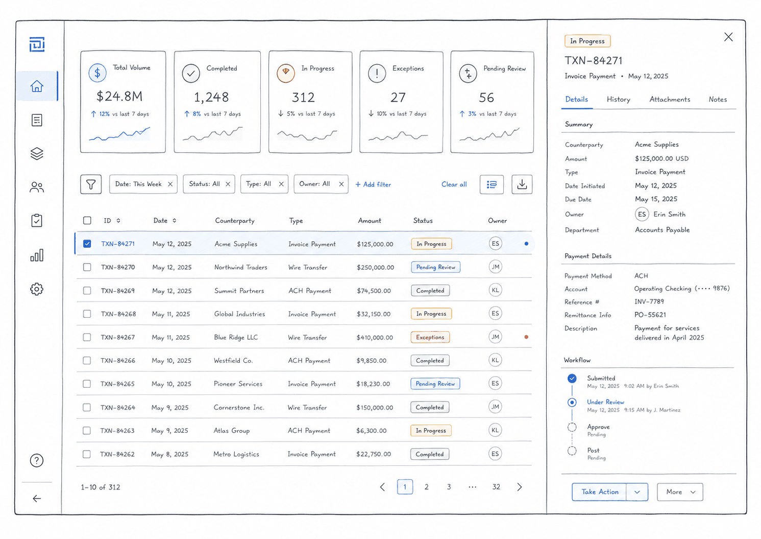
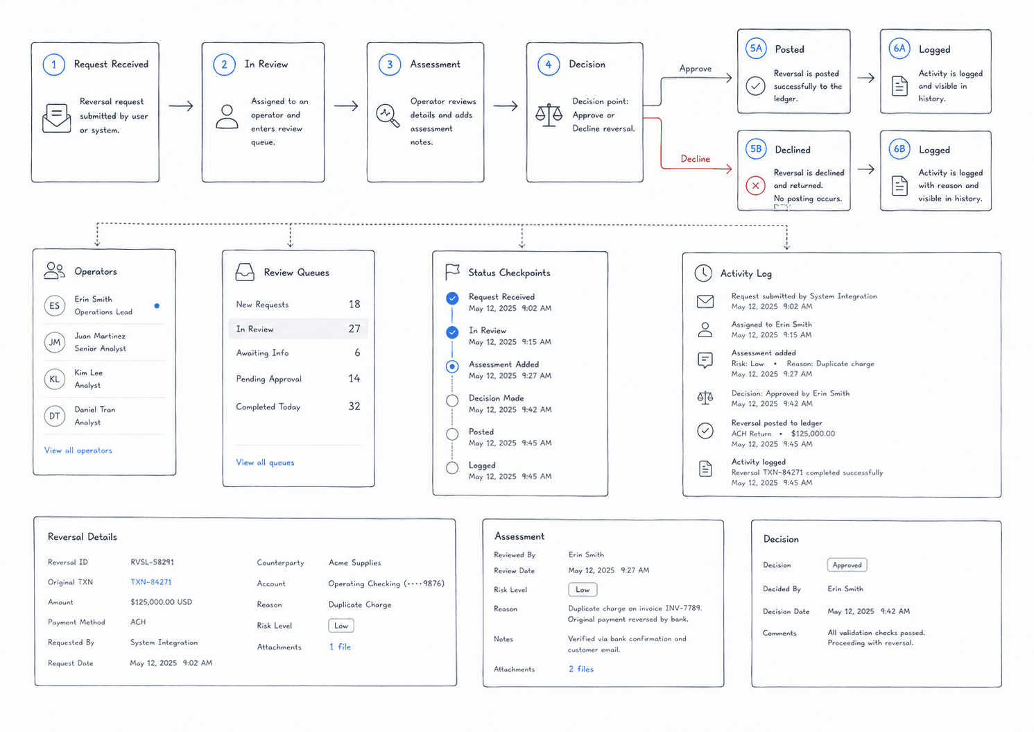
IDs became doorways
Transaction IDs and token IDs were not just labels.
They were entry points.
A user might start with a row in a table, but the real investigation often happened one level deeper: metadata, payment history, token details, status changes, reversal information, timestamps, and related activity.
The design needed to make those identifiers feel useful without overloading the table itself.
By making IDs clickable and connecting them to detail views or drawers, the portal could keep the main table clean while still giving users access to the depth they needed.
The table stayed scannable. The detail view carried the complexity.
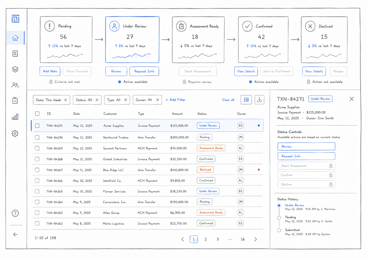
Reversals needed guardrails
Reversal management was one of the most important workflow problems.
Not every reversal could be treated the same way. Some could be managed through the portal. Some were handled through API. Some looked pending at a high level but were not actually ready for action because of their sub-status.
That created a design challenge: how do you let users move quickly without letting them take unsafe actions?
The answer was to make action availability follow the real state of the transaction.
Buttons, bulk actions, disabled states, tooltips, and status messaging all had to help users understand why something could or could not be done.
The goal was not just to show data. It was to prevent mistakes.
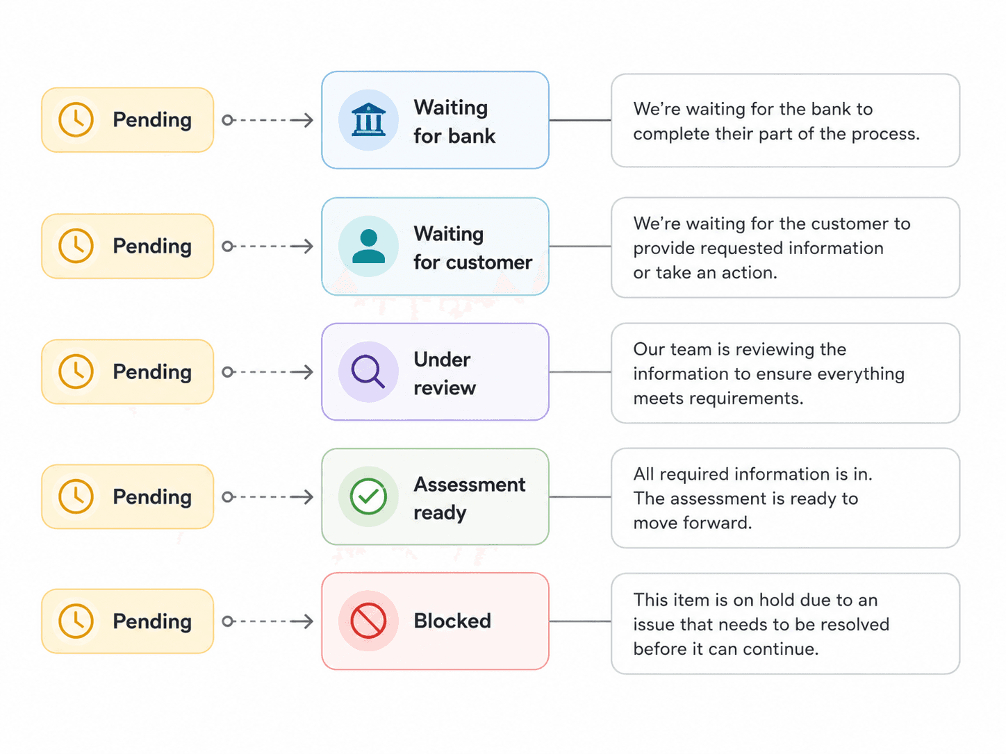
Not every pending state means the same thing
“Pending” sounds simple, but operationally it can mean different things.
A pending reversal could be under review. It could be waiting for assessment. It could be ready for the next step. It could be blocked from action because another system owned that part of the workflow.
That meant the portal needed to avoid broad labels that created false confidence.
The UI had to communicate the difference between “pending and waiting” and “pending and actionable.”
This is where sub-status became important. It helped the interface explain what was happening beneath the surface and why certain actions were enabled or disabled.
Designing for investigation
Portal users do not browse casually.
They investigate.
They come in with a question: What happened to this transaction? Why is this reversal not moving? Which transactions need attention? Why is this action unavailable? What changed since the last status update?
That changed how I thought about the experience.
The portal needed to support a rhythm of scanning, filtering, selecting, opening details, checking history, and taking action. Each step needed to preserve context so users did not feel like they were jumping between disconnected pages.
The best version of the portal made investigation feel steady and controlled.
Clear tools for complex work
The visual design had to support clarity over decoration.
Operational users need stable hierarchy, predictable controls, readable tables, clear statuses, and obvious action rules. The interface cannot rely on polish alone. It has to earn trust by being consistent.
I focused on making the portal feel calm, structured, and easy to reason through.
The work was not about hiding complexity. It was about organizing it so users could make better decisions.

What changed
Konek Portal helped turn complex payment operations into a clearer working system.
The experience made it easier to scan transactions, understand status, access deeper details, and know which actions were safe to take.
Status became more than a label. It became part of the interaction model.
Tables became more than a place to display data. They became the control surface for investigation and action.
What I took from it
Konek Portal taught me that operational design is where trust gets maintained after the customer-facing experience ends.
A payment can look simple to the customer, but someone still needs to manage the system behind it.
Good portal design does not make complexity disappear. It makes complexity legible, actionable, and safer to work with.


