06
Interac Corp.
LIVE Product

Client:
Interac Corp.
Date:
LIVE Product
Role:
Making pay-by-bank feel native to checkout
Konek Checkout lets customers choose their bank, authenticate, and pay directly from their account. No card number, no expiry date, no CVV, and no saved card credentials.
The product introduces a new way to pay, but the experience still has to feel familiar at the exact moment someone is trying to finish a purchase.
Checkout is a momentum problem
The challenge was not just making pay-by-bank work. It was making it feel like it belonged inside checkout.
A customer in this moment is not exploring a new product or trying to understand the system behind the scenes. They are trying to complete an order. Every extra screen, unclear handoff, repeated review, or heavy consent moment risks slowing them down or making the payment feel less trustworthy.

Too much of the system was showing
When I joined the work, the flow carried too much of the system’s complexity.
Customers were being asked to understand Konek, choose a bank, review payment details, accept consent, authenticate with their bank, return to Konek, review again, and confirm.
The flow was technically complete, but it felt heavier than it needed to. It was asking customers to think too much at a moment where momentum mattered most.
Separating attention from ceremony
I started by mapping the full journey and separating moments that genuinely required customer attention from moments that were mostly system ceremony.
Some steps needed to stay because they created trust or supported consent. Others could be moved, combined, delayed, or removed entirely.
The work was not about making the flow shorter for the sake of speed. It was about making every remaining step earn its place.
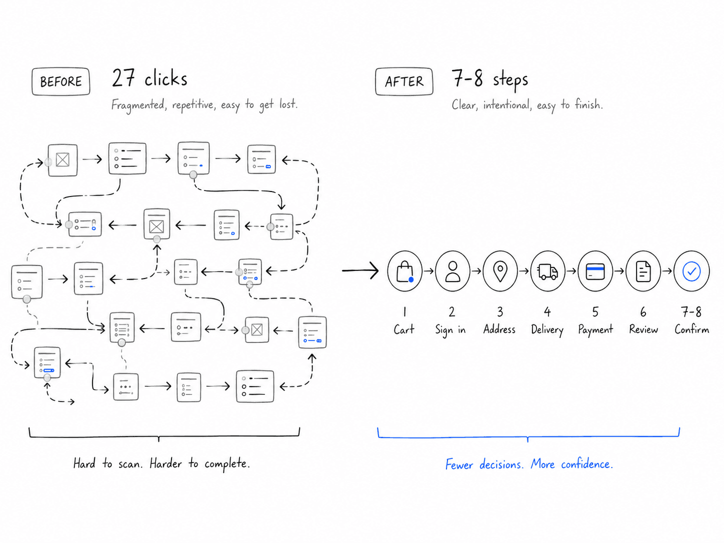
From 27 clicks to 7 meaningful steps
The original experience had roughly 27 clicks. Through flow mapping and iteration, we reduced it to 7–8 meaningful steps.
Email verification could happen later. Duplicate review moments could be removed because the merchant had already shown the order summary. Consent could be made clearer without forcing customers through unnecessary ceremony.
The result was a checkout flow that felt lighter, more direct, and easier to understand.
Recognition beats reading
One of the most important parts of the experience was the bank selector.
On the surface, it looked like a simple selection screen. In reality, it carried a major trust moment. Customers were being asked to pay in a new way, so recognition mattered.
We explored dropdowns, search-first patterns, long lists, and logo grids. The logo grid worked best because people recognize their bank faster than they read its name.
That made the selector feel less like navigation and more like a familiar anchor inside a new payment experience.

Trust your device
Passkeys needed the same level of care.
Most customers do not think in authentication models. They think in moments: can I continue, is this safe, what is my device asking me to do, and will this work next time?
The passkey experience needed plain language, personal-device guidance, and reassurance around biometric privacy. The goal was to make passkeys feel like a natural extension of checkout, not a technical requirement dropped into the middle of payment.
The handoff had to disappear
The hardest part of pay-by-bank is that Konek does not own the entire journey.
The customer starts in a merchant checkout, enters Konek, authenticates with their bank, and returns to complete payment.
Technically, that is a multi-system flow. Emotionally, it needed to feel like one connected action. The transition language, loading states, bank selection, return state, and confirmation all had to support that continuity.

The return moment
The return from bank authentication was one of the most sensitive moments.
The customer had just approved something with their bank, so a vague spinner or unclear loading state could create doubt.
The return state needed to feel connected to the action that had just happened. We explored ways to make confirmation feel more confident, using clearer status language, stronger visual hierarchy, and motion that helped the payment feel like it was resolving rather than waiting in uncertainty.

Clearer feels safer
The visual refresh also mattered.
A lot of financial products try to feel safe by becoming dense, conservative, and over-explained. I wanted Konek to feel safer by feeling clearer.
The interface moved toward stronger hierarchy, more breathing room, simpler decisions, and a calmer visual system.
The goal was not to make the product feel trendy. It was to make it feel current and cared for. In financial products, polish matters because trust is affected by the small details.
What changed
The work helped make Konek Checkout feel lighter, clearer, and more connected to the checkout context.
The flow moved from roughly 27 clicks to 7–8 meaningful steps. The bank selector became easier to recognize. Passkey setup became easier to explain. The handoff between merchant, Konek, and bank became more intentional.
Most importantly, the experience became less about teaching customers a new payment category and more about helping them complete a payment with confidence.


