05
Interac Corp.
Coming 2027

Client:
Interac Corp.
Date:
Coming 2027
Role:
Designing the consumer layer of Canadian payments
Konek App explored what happens when Canada's most trusted payment network evolves into a consumer product.
Rather than introducing a new way to move money, the opportunity was to make existing payment behaviours feel more connected, more personal, and easier to act on across everyday moments.
Why now?
Interac already powered millions of payment moments through e-Transfer, debit, authentication, and account-based payments.
The opportunity wasn't to build another wallet.
It was to create a direct consumer relationship while extending the value of the existing payment network.
What we observed
Early concept work and behavioural research pointed toward one consistent pattern:
People rarely open payment apps to explore. They open them because something already happened.
Dinner.
Rent.
Tickets.
Paying someone back.
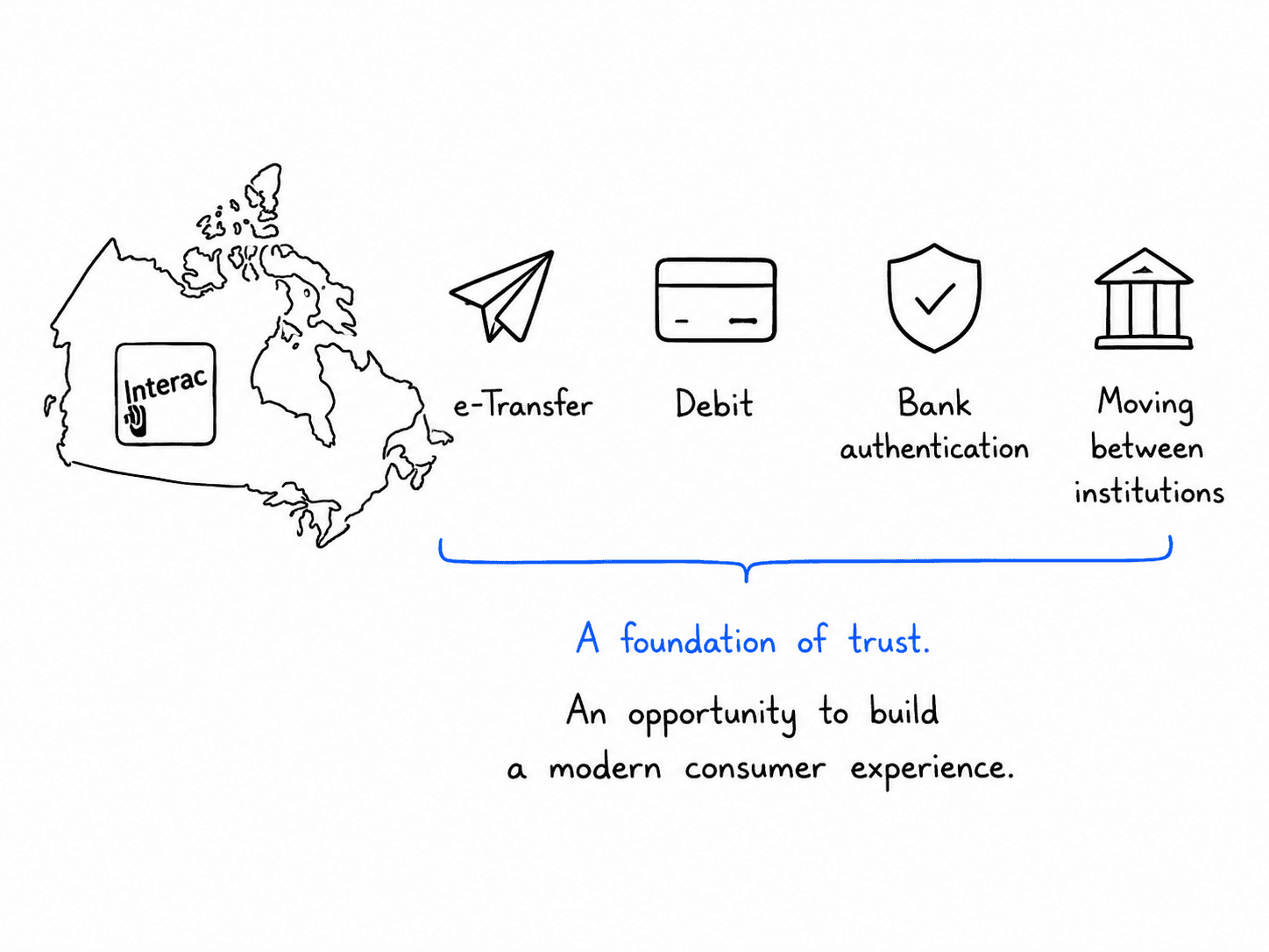
Canada already moves money through Interac
That existing trust fundamentally changed the design problem.
Konek did not.
In Canada, Interac already sits close to everyday money movement. It is how people send money, pay with debit, authenticate with their bank, and move between financial institutions. That trust creates a rare opportunity: a new consumer product does not have to convince people that the network is real. It has to make the network feel useful, personal, and easy to act on.
That changed the design challenge. The app could not feel like a startup wallet pretending to be financial infrastructure. It had to feel like trusted infrastructure becoming easier to use.
Not another wallet
A lot of payment apps become containers.
Cards, balances, offers, activity, promotions, settings, rewards, receipts, and financial noise all end up competing for attention.
The strategic decision became clear early. Konek didn't need another financial dashboard. It needed to reduce the distance between intention and payment.
Someone covered dinner. A friend bought tickets. A roommate is collecting rent. Two people are standing beside each other and need to settle up. A customer is paying in-store. A reward should apply before the user has to think about it.
The product needed to feel less like a place to browse money and more like a tool for resolving everyday payment moments.
Payment starts with a person
The app is not only about amounts.
It is about people.
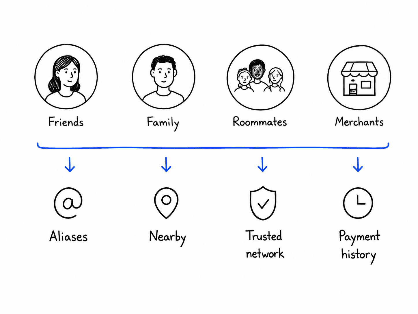
Who are you paying? Who requested money from you? Is this the right contact? Is this the right alias? Is this person nearby? Is this the same person you paid last time?
That made identity a core part of the experience. The app needed to make people feel recognizable, not abstract. Contacts, aliases, proximity, profile details, and confirmation moments all had to work together so users could act quickly without feeling careless.
The goal was to make money movement feel social without making it feel casual.
The right person matters
In payments, speed is only useful when the user feels sure.
Sending money to the wrong person is not a small UX mistake. It is a financial mistake.
That meant confirmation could not be treated like a boring final screen. It had to do real work. The experience needed to help users verify the person, amount, payment method, and context without slowing everything down.
I explored patterns where the app could surface just enough certainty at the right moment: recognizable names, profile cues, aliases, bank-backed trust signals, recent activity, and clear final confirmation.
The interface had to answer the question users are quietly asking before they tap send: “Am I sending this to the right person?”
Speed still needs certainty
The hardest balance was speed versus reassurance.
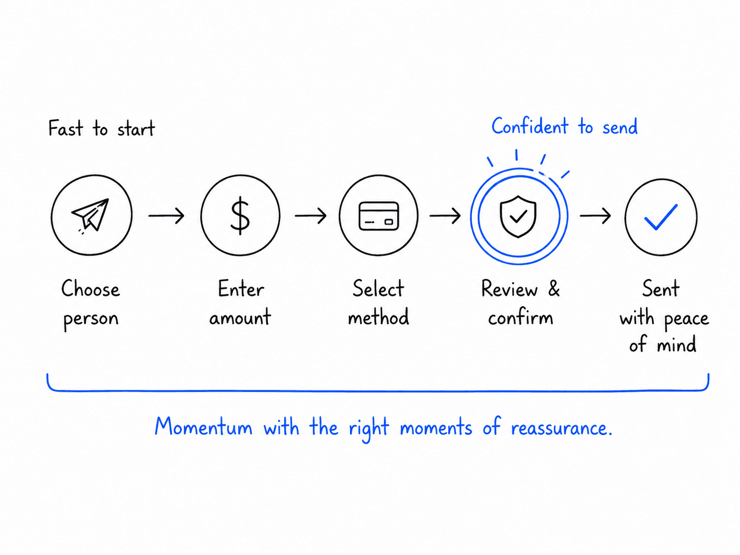
A payment app should feel fast. But if it feels too fast, it can become stressful. Users need momentum, but they also need confidence that the action is correct.
The design approach was to make the common path feel immediate while keeping moments of risk clear and deliberate.
Sending, requesting, tapping, and paying nearby should not feel buried behind heavy flows. But the app still needed strong confirmation patterns, clear status language, and visible recovery points if something changed.
The goal was not one-tap everything. The goal was confident speed.
Tap, send, request, repeat
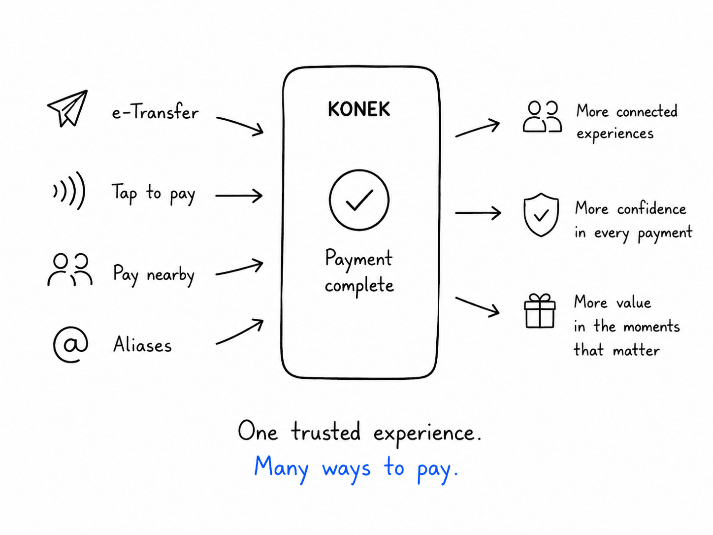
The product needed to support multiple payment behaviours without feeling like multiple products.
Sending money, requesting money, tap-to-pay, proximity payments, aliases, loyalty, and rewards could easily become separate features with separate mental models.
I worked through how these behaviours could share the same underlying structure: choose the person or merchant, understand the context, confirm the value exchange, and complete with confidence.
That helped the app feel more coherent. The interaction patterns could flex across different payment moments without forcing users to relearn the product each time.
Rewards should already be there
Rewards are often treated like a side quest.
Users have to remember they exist, look for the offer, activate something, copy a code, or choose the right card. That creates effort right when payment should feel simple.
For Konek, rewards had to feel preloaded.
The opportunity was to connect payment and value in the same moment. If a user is paying, any eligible reward should be visible, understandable, and easy to trust. The app should not make people hunt for value. It should make the value feel attached to the payment.
The design principle was simple: rewards should support the payment moment, not interrupt it.
The app is only the surface
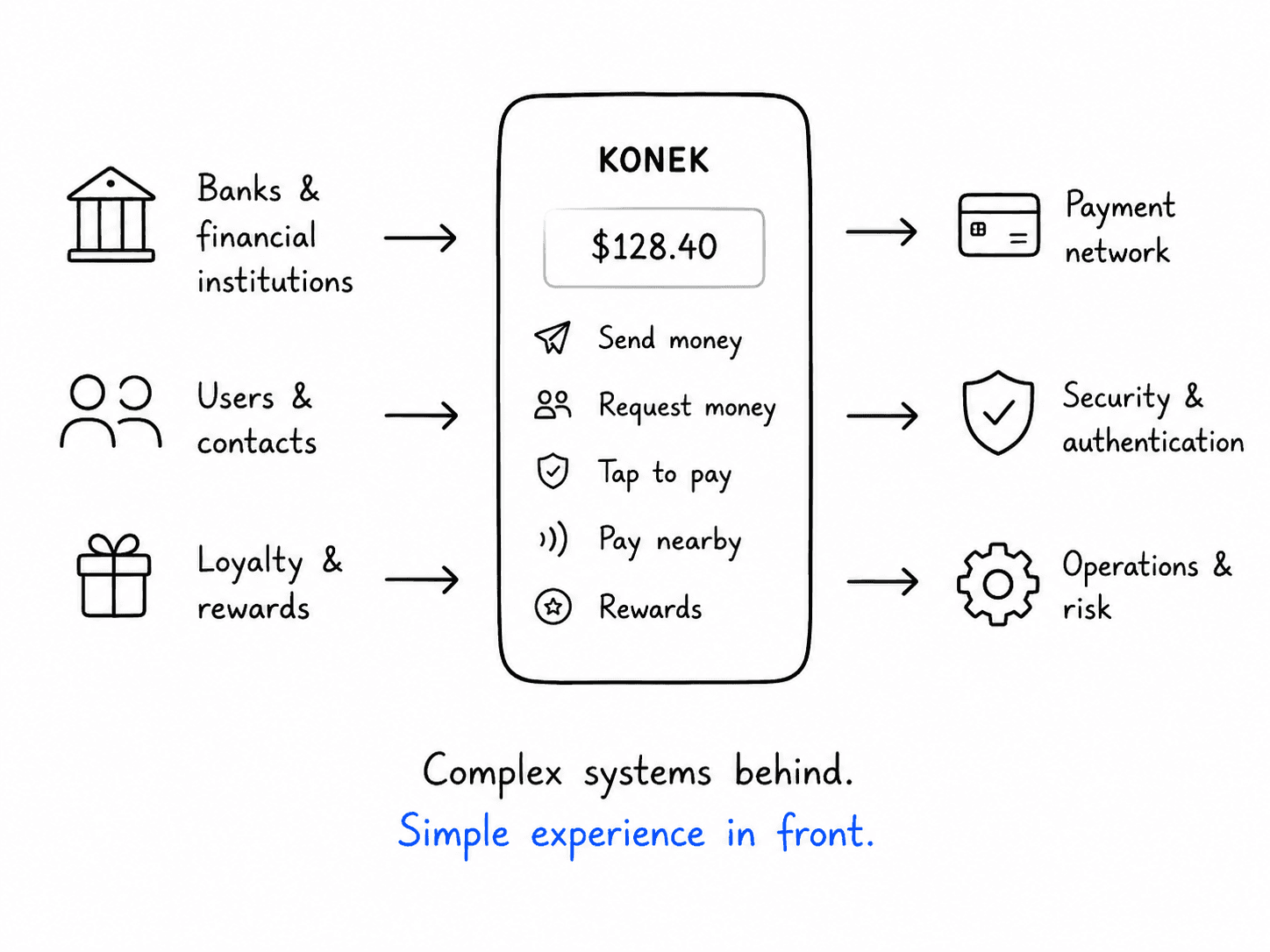
The app may be the part people touch, but it sits on top of a much larger ecosystem.
Bank authentication, aliases, account-based payments, merchant acceptance, loyalty, transaction status, security, and operational logic all have to work together behind the scenes.
That is what made the work interesting. The screens had to feel simple, but the product underneath was not simple at all.
My role was to help translate that system complexity into an experience that felt obvious on the surface. The app needed to hide the machinery without hiding the trust.
What this could unlock
Konek App has the potential to turn Interac’s payment network into something people interact with more directly every day.
Not just when they receive an e-Transfer. Not just when they tap a card. Not just when a merchant offers pay-by-bank.
A single consumer layer could connect sending, requesting, tapping, rewards, aliases, and account-based payments into one trusted experience.
That is what made the product feel big. It was not just a new app. It was a way to make Canadian money movement feel more connected, more personal, and more useful.
What I took from it
Konek App taught me that payment design is not really about money.
It is about timing, trust, identity, and confidence.
The best payment experiences do not ask people to understand the network. They let people act in the moment, feel sure about what they are doing, and move on.
That became the north star for the work: make a national payment system feel simple enough for everyday life.
See it in action


